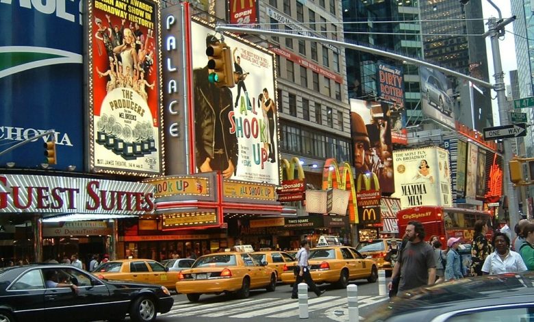
The Psychology Of Colors Behind The Digital Signage

There is a science behind choosing color combinations for digital signage to make your business a bigger brand in the market. One of the most shared colors in the marketing industry is red because it creates a sense of energy and excitement that fits almost all major food industries. Whereas blue builds a sense of trust and security, which is why you see it so often at hospitals and financial institutes.
So, what’s the right color for your business and the digital signage you use for visual communication? Find the best color combination for your outdoor lightbox sign in this blog!
Color Theory In Digital Signage
Colors are the first thing people notice on encountering a billboard or a digital sign that leaves an instant impression of the brand in their minds. A study titled ‘Impact of color in marketing’ says that 90% of the judgments made about the products are based on colors alone. This discovery makes the use of the correct color combination in digital signage more significant for marketers.
1. Psychology of Red
Red is a primary color in most digital signage because it attracts attention more quickly than any other color. This is why many food industries such as Burger King, McDonald’s, etc., use red as a primary color to attract potential customers.
So, if you are creating a digital menu board or advertising an event, it would be wise to use a hue of red in your signage design. This way, your message will reach the desired audience fast. However, avoid overuse of this color, not making the digital signage very intimidating and overwhelming for the viewers.
2. Psychology Of Orange
Orange is mainly used as a secondary color in most outdoor lightbox signs as it creates a feeling of friendliness. Orange also has traits of confidence and cheerfulness. This is why many beverage companies such as Miranda, Fanta, etc., use orange in their advertisement signs.
When designing a sign that incorporates orange in it commands attention without overpowering your content. It is an excellent alternative to red and is perfect for welcome messages.
3. Psychology Of Yellow
Yellow color is highly associated with happiness, intellect, joy, and warmth. When used in digital sign can create a feeling of optimism. Saturated yellows grab attention faster, so many dairy products and snack companies like Lays use yellow to advertise their products. However, overuse of yellow can have a disturbing effect.
4. Psychology Of Blue
The blue color usually conveys calmness, responsibility, a sense of trust, and dependability. A lighter blue tint can make a design appear lighter and friendly, whereas darker blues have a more substantial effect. Thus, if your message is meant to carry authority, opt for a dark palette and if you want to energize and excite your audience with your message, go for brighter blues.
5. Psychology Of Green
Green is the color of nature; that’s why it is often associated with growth, freshness, and fertility. When used in digital signage, green has a balancing and harmonizing effect. It is a very stable color to design your messages regarding wealth, renewal, growth, and nature. This is the reason why many of the fertilizer companies and banks use green in their signage.
In A Nutshell
Your color combination is the first thing people notice when they take a glance at your display. So try to keep its balance between bold and lighter shades. That way, you can use the colors to your benefit.
If you need a personalized lightbox sign, you may contact Signs Wholesale Now.


